CERN's
Publishing Platform
WHAT, HOW & WHY.
This was project made for revamping the current Publishing Platform of CERN, meaning all of their database of papers, research and annual reports. It aimed not only to a better looking and more intuitive interface, but also to an overall experience that would make CERN's library much more used and popular as there is no paywall in place for these files.
As the team built had no programmers, we went only on aesthetics and functionality. We eventually talked to the programming team of the Publishing department, and as of late 2017 they are still working to implement it. We built a modular website in which it was fairly easy to add entire sections, as the whole point was to make scalability not only a tool but a norm. We had the invaluable help of R2 Media Factory, a design studio based in Barcelona.
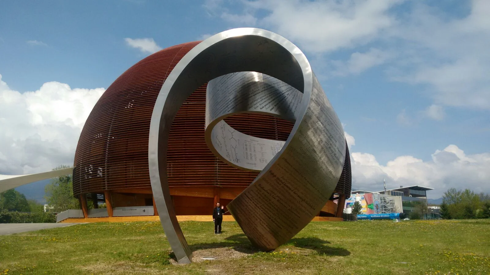
Even though I was a bit shocked when I heard the name 'CERN' thrown around, I couldn't miss the opportunity of working on the site of so many scientific and technological advancements have been made. Not only did our team of three designers went on and presented to CERN representatives, but we had a chance to go Geneva and make acquaintances with the birthplace of the Internet.
BRANCH OUT

The first thing we did was go crazy. Not in the disorganised way, on the contrary. We thought of how many things a site of this category could do, or rather, what users could do with it. A social part, a section of to the day news, a portion for uploading yourself, some sort of online tutoring.
This was not to have something so large that the client would be horrified, but rather a process in which we can take out most of the non-applicable ideas at first so we could focus on the few parts that would pass the filter.
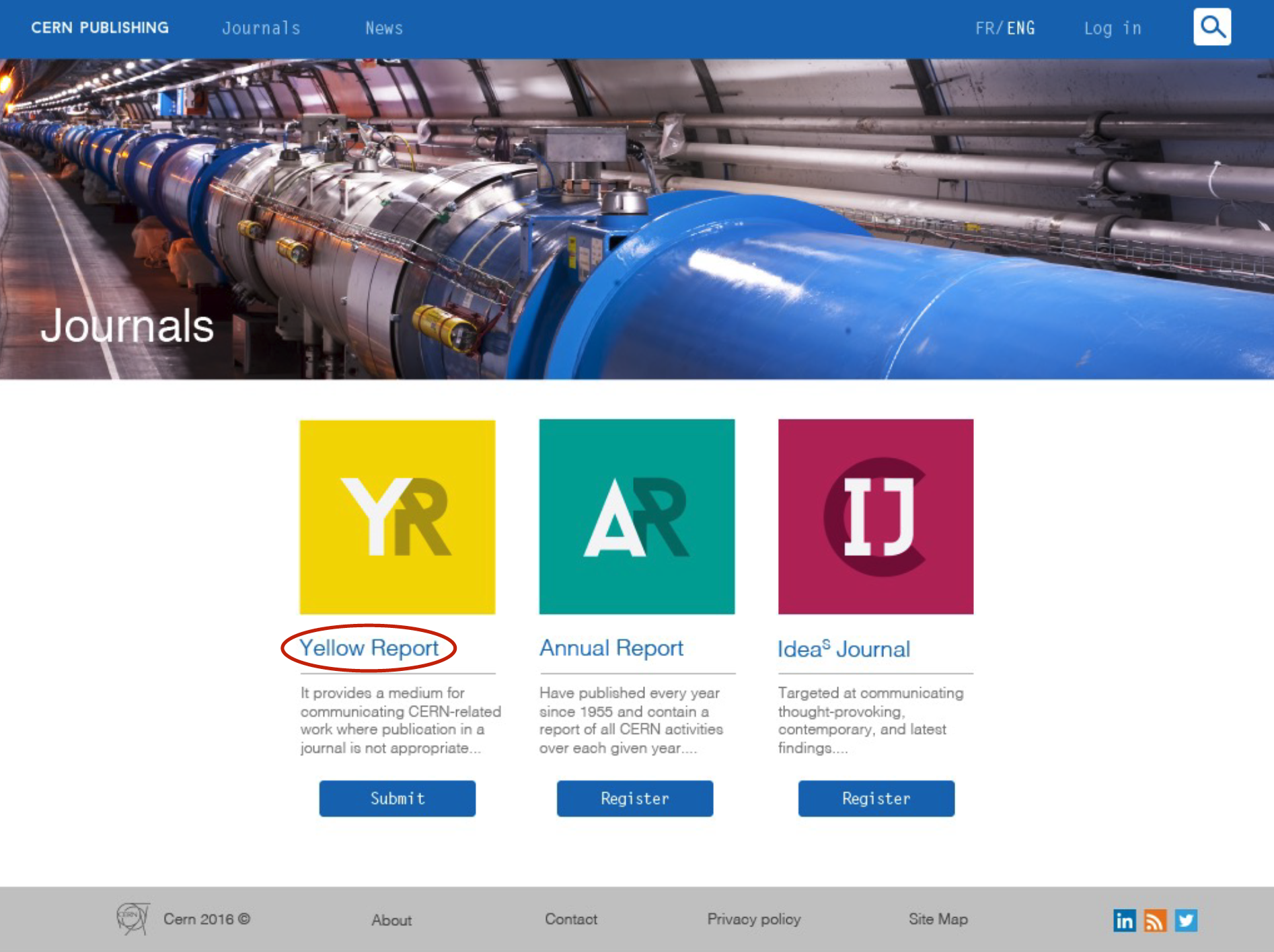
SQUARED OUT
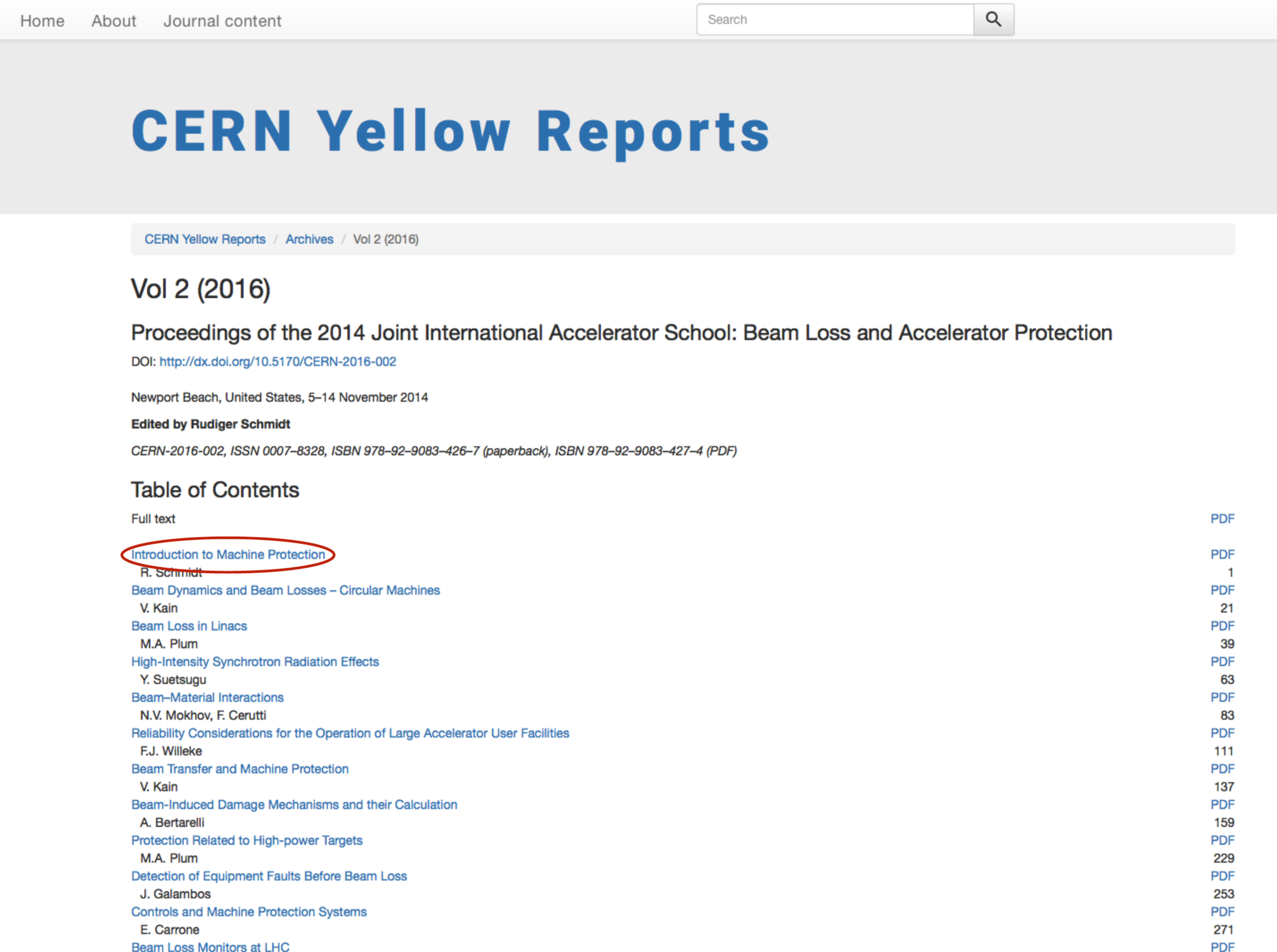
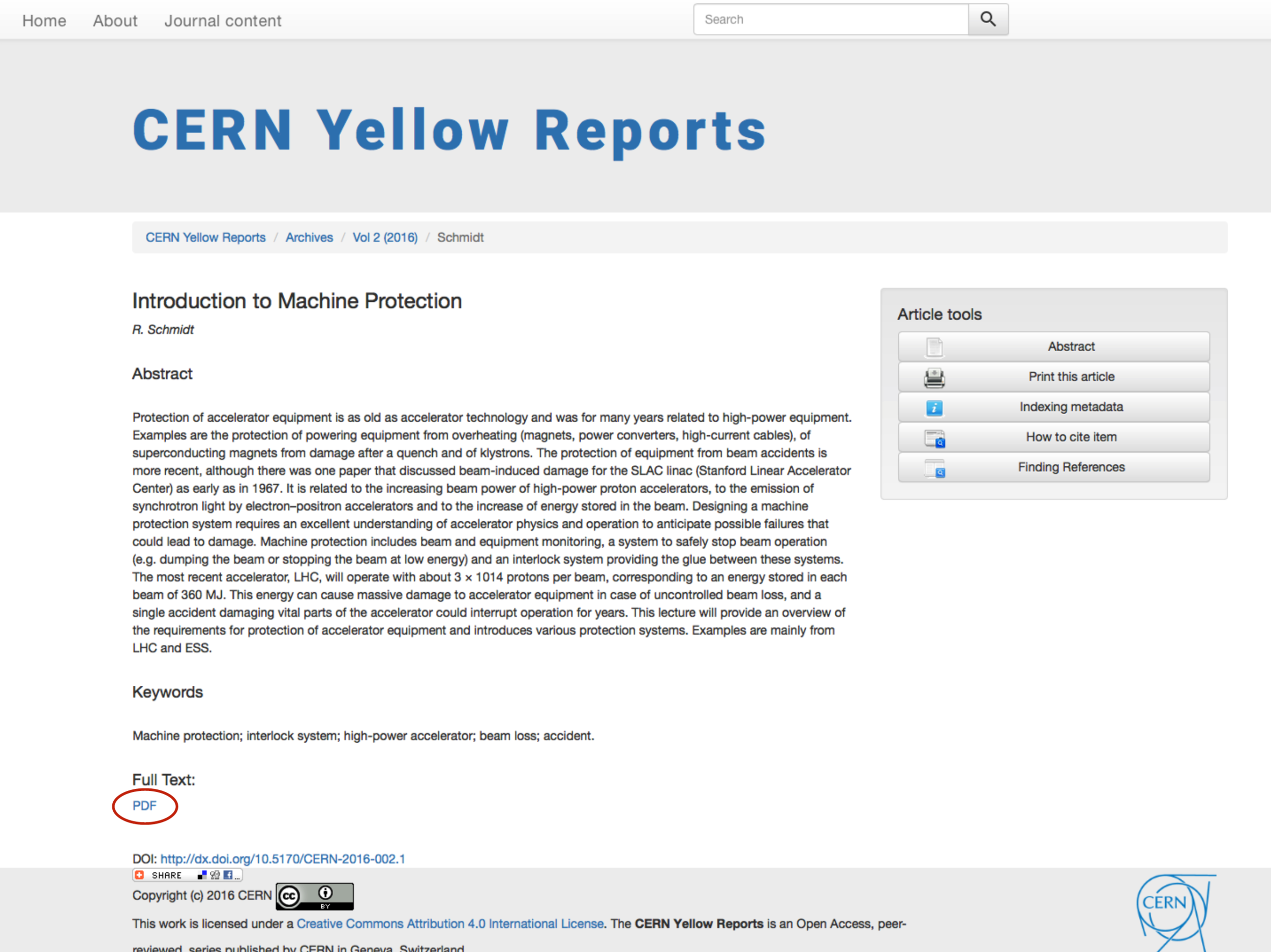
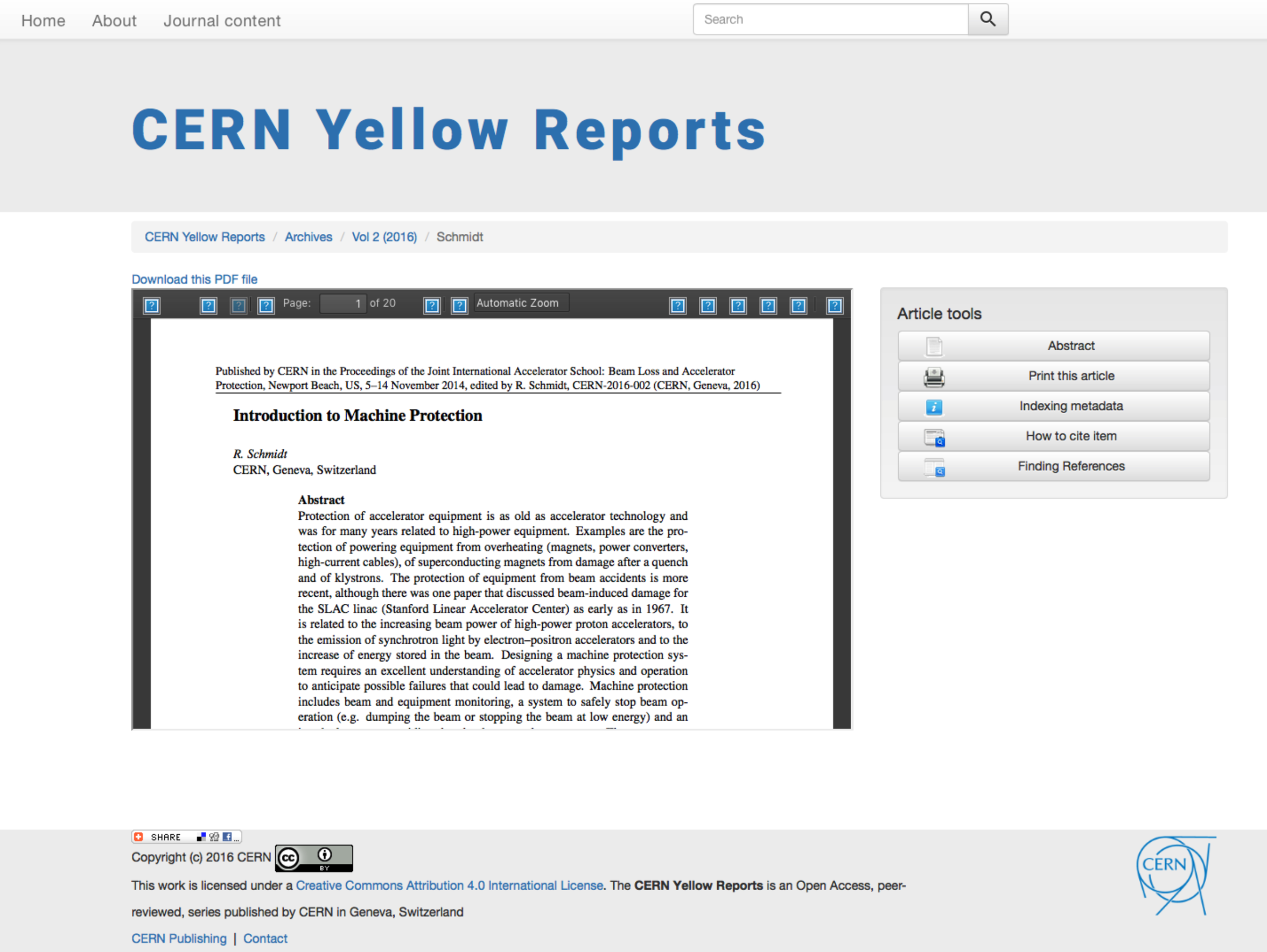
From the screenshots of the current website, it takes 5 clicks to just see a PDF, and that's finding the right hyperlink first and not making any mistakes.
Also, after you are met with a kind of box that has the pages inside, the user sees about 6 buttons with broken icon links, and bunch of options to the right.
I'd guess 'modular', 'simple', and 'intuitive' are words that are thrown around in the design world often, so we wanted to skip labels and sell it as not the only solution every website on Earth needs, but the probable best solution for this case.
CLEAN CUT
The most complicated part of the project was finding out just how many actions you could do with one single paper. There were over 20 buttons that led to quoting, referencing, and printing, sometimes repeating functions. This was pretty hard on the user, as one type of citation, for instance ABNT or MLA, took over 5 clicks to get to.
The issue was not that the papers were confusing, it was that everything surrounding this confusing paper required an absurd level of previous knowledge. So we started fresh, collected all of the possible functions a file could have and went from there, as it is easier to just disable a few options out of many, than to add a scroll down menu all of the sudden.
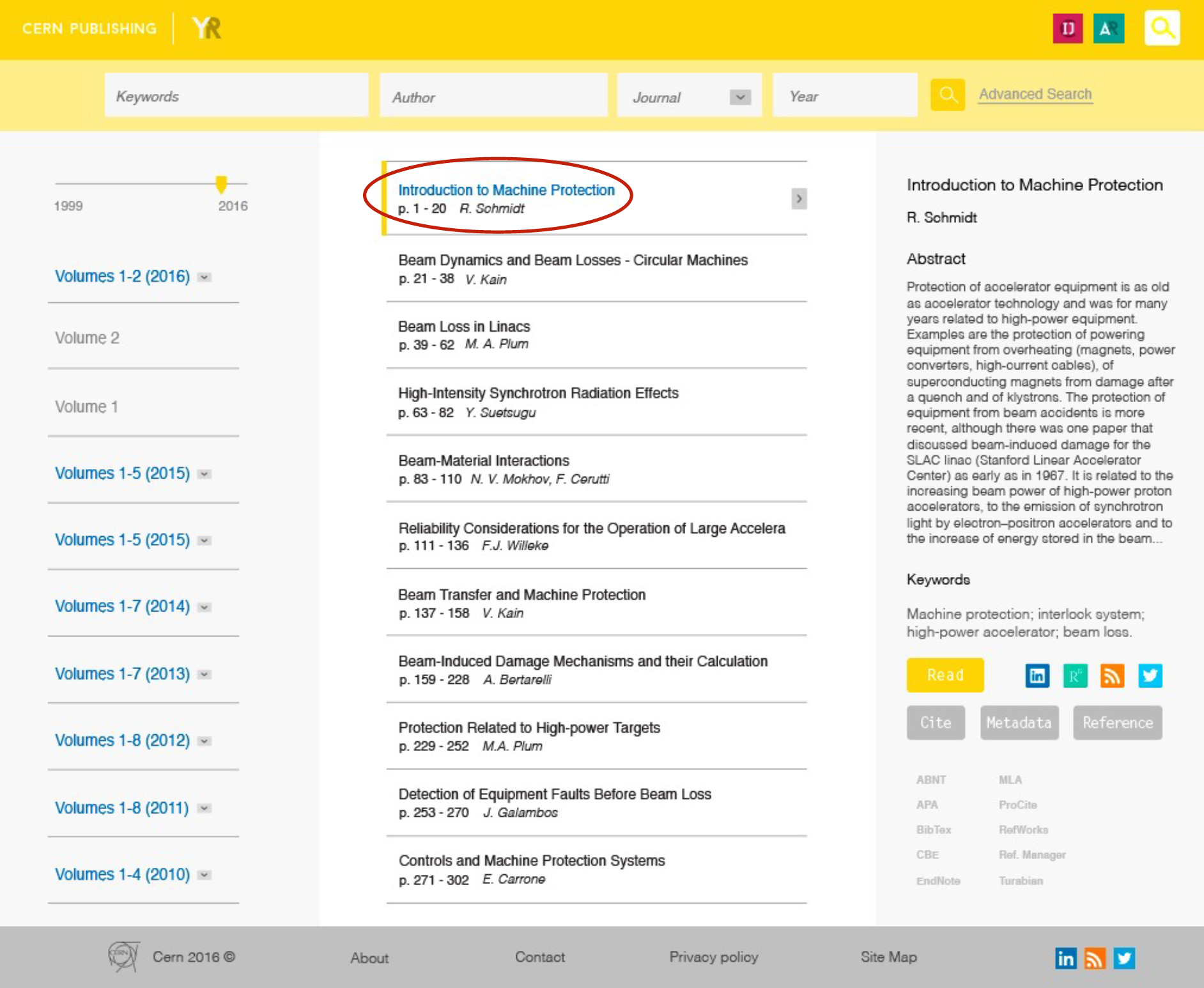
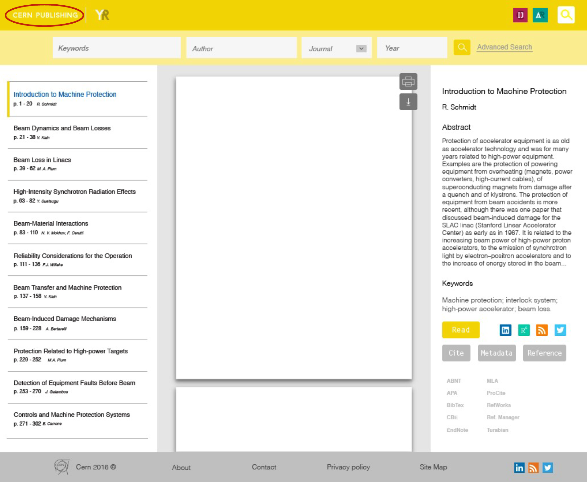

We used InVision in order to map out the site. It was also how the client controlled the live demo.
SELL TO CERN
The final steps were probably one of the most comfortable I've spent in any project. The keynote went pretty much flawlessly, as even the riskiest part of the presentation went as smoothly as possible. Demoing anything in front of a client is nerve racking, but we were so obsessed with having the cleanest, most professional attitude on all fronts, even that was calmly done.
Giving a live presentation of a on-going demo with the client controlling the screen was extremely risky, as one mis-click could lead them out of bounds, access an area not yet developed, and 100 other things, but thankfully we predicted all scenarios and it went without skipping a beat.
TIME FOR THE FUTURE
This is a migration of one of the largest online libraries ever made, so we are not particularly nervous about the layout and changes not having been made yet.
The latest feedback we got was that things move slowly with projects this big, so to be patient as programmers and designers are trying to fit a non-urgent matter that works for all purposes for a completely new look that might rattle the old guard.
Certainly going to Geneva, walking amongst a few of the brightest minds on Earth, past and present, was an incredible experience that I got to have again just a few months later in another project.
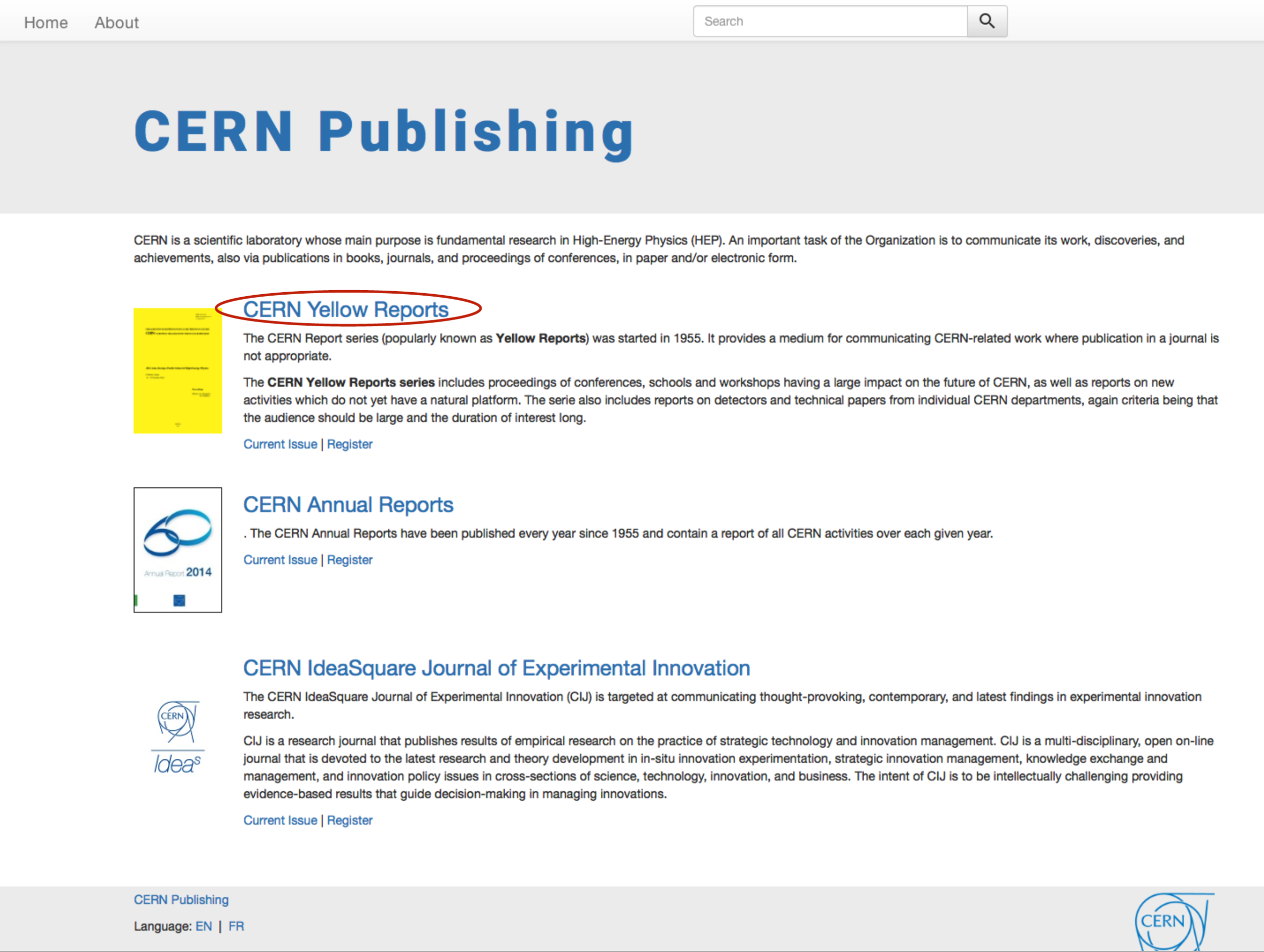
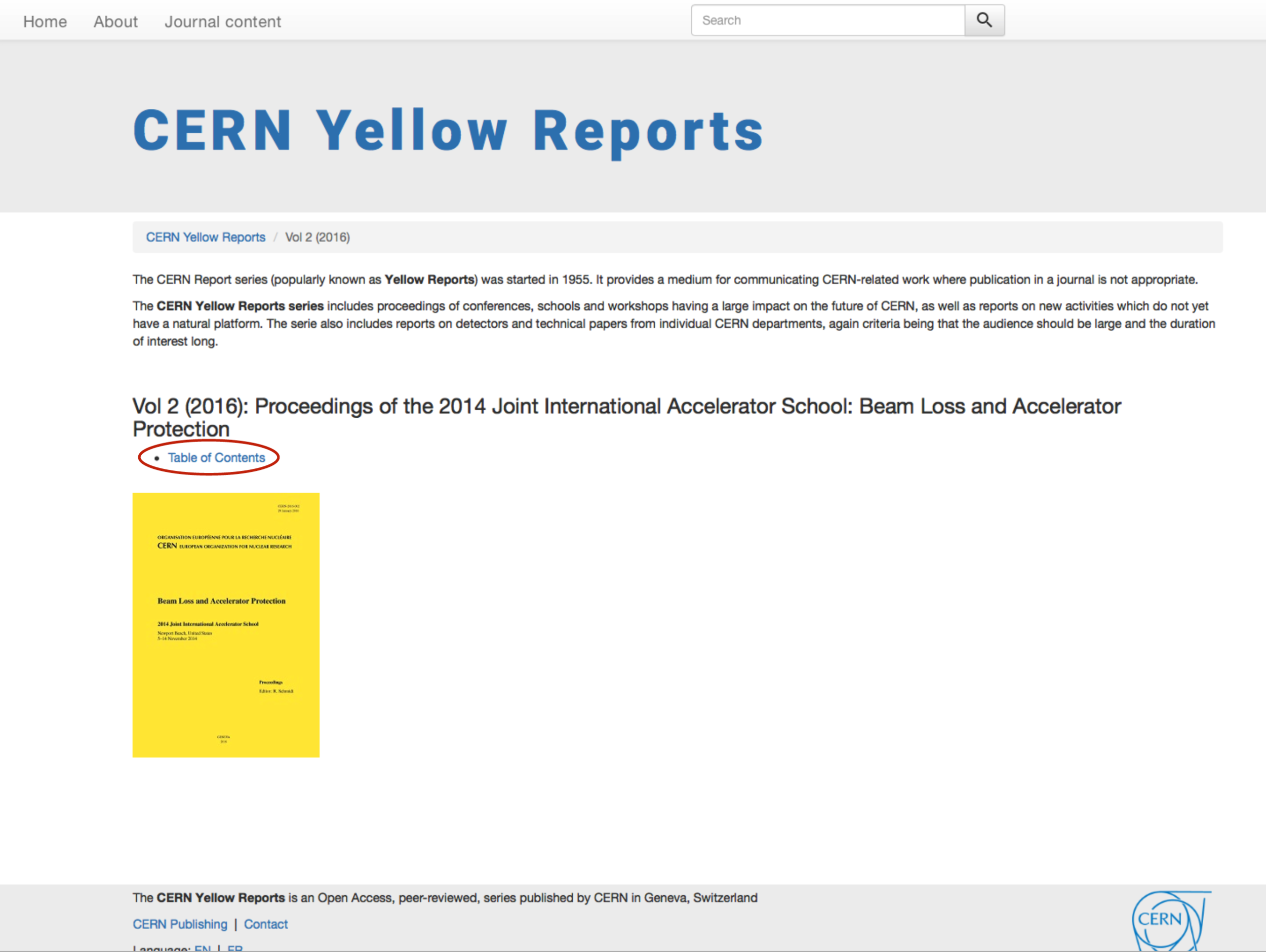
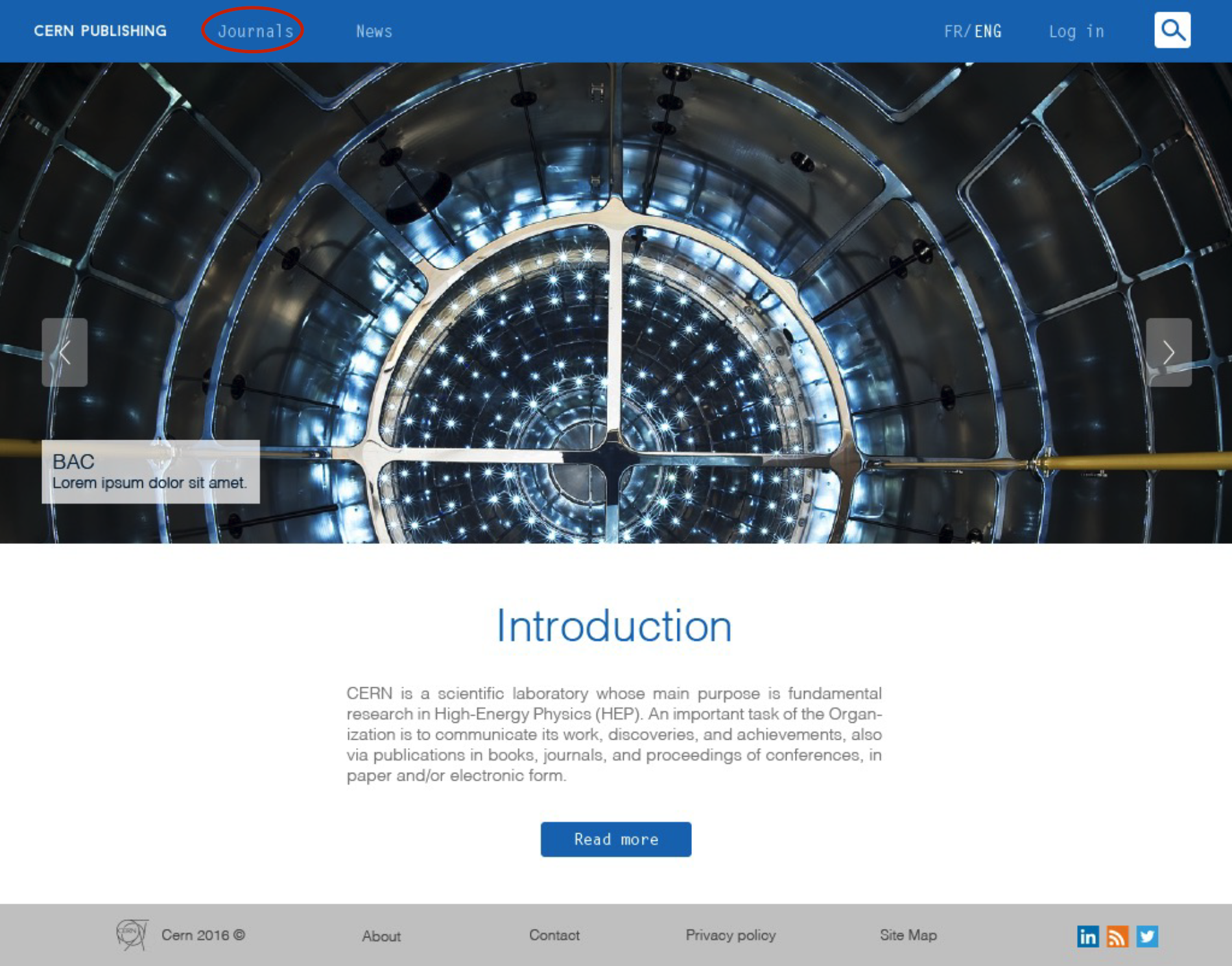
Certain things are changing in the site, like the Favicon in certain categories and the colour of each publication, following our guidelines. This is a screenshot from the site in late 2017.
TEAM: JUNIOR GONZÁLEZ, MARIANA BARRIENTOS, OLGA PIPNIK.
SPECIAL THANKS: PABLO RUIZ, ALBERT SALORD, HERNÁN ORDOÑEZ, LUCIANA LEVERATTO, VALERIA BRANCOLINI.